Strategist & content creator
Tamwood UX1 Assignment - Ecovita
For the final assignment of Fundamentals of UX Course, the professor asked for the teams to create a website with the theme "making the world a better place". The target audience should be age 25 or less.
Scope: UX1 final assignment.
Duration: 1 week
Team: Gabriela Kurtz, Priscila Requena, Eduardo Arreguin.
My role in the project: Strategy, content and copywriting.
Brainstorming process
Each of the members had to come up with at least 7 sentences of things that could make the world a better place. After that, we did an affinity diagram to decide our focus.
.jpg)
We made the affinity map separating our ideas in 6 main areas: Social; Inclusivity; Animal Cause; Food, Thrash/Waste; Environment. After that, we understood the Environment was the umbrella concept we wanted to work with, and sorted other subjects that were related: Thrash/waste and Food.
Project focus
An NGO to help people to become more conscious about the impact they have in the world.
Target: young adults, 18-25 years-old, living in Canada
What: a platform with tools, tips, events, workshops and counselling
Moodboard
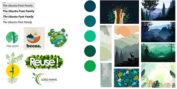
To settle how our branding would look like, we created a moodboard. It focused on a nature-inspired color pallete, along with vector art and textures. The font, Ubuntu is simple and easy to read, so we choose it for the website.
Branding
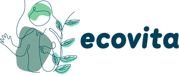
We opted for free-hand drawn lines, for an organic feel design. Since the project is about people, we focused on the human figure along with leaves, relating the person to sustainability. The font, Menco, was chosen to evoke the light-hearted tone we wanted for the website. The name ecovita is the junction of the words “ecology” and “vita”, that means life in Italian. It suits the brand because our objective is to raise awareness about a environment-conscious life.
Brand persona
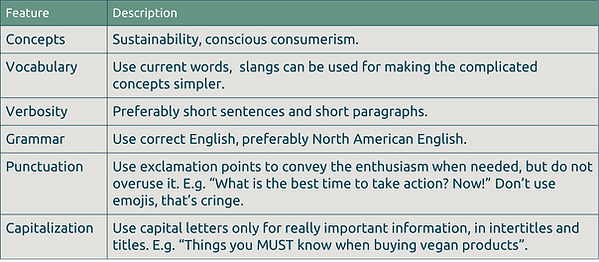
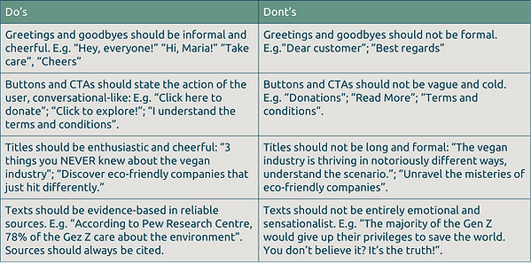
The Brand persona represents the guidelines for branding and communication in general. We created it based on our vision for Ecovita. I was responsible for creating the Brand persona, since I had a background in marketing and advertising.
Bio: EcoVita is a contemporary hippie (ideology speaking), they have a simple style, usually wears jeans and a white shirt. They are very enthusiastic about sustainability and love to share their passion with the world. They are young (very TikTok inspired), but also an old soul, taking inspiration in simpler times.
Main Goal: Help people to become more conscious about the impact they have in the world
Voice tone: Passionate and enthusiastic
Semantic Constellation: sustainable living, conscious consumerism, responsibility, eco-friendly, vegan, carbon footprints
Slangs: no cap, cheugy, drip, hits different, bet, skrrt, understood the assignment, say less, slap, low-key/high-key, bussin’, vibing.
Ways to argue: evidence-based arguments but passionately conveyed.
References they use when talking: Consumers International, B Corporation, WWF, Peace Geeks, Egale.
Personalities they admire: Greta Thunberg, Malaika Vaz, Hans Ngoteya, Lennox Yearwood Jr.
Sitemap
The sitemap was structured to showcase the NGOs achievments and also to be a helpful tool for people who want to live being more conscious about their impact in the world in general.
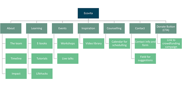
UX Decisions
When designing the website, we made some UX decisions based on the content we had during the class. I was responsible for gathering the insights and organize our decisions into the following text:
1. Model Driven method: since we had two weeks and three members to work with, we choose to approach this project based on other successful NGOs. We did a benchmark on their websites to understand what was alterady being applied and adapted to our project needs. Consulted websites:
https://www.consumersinternational.org/
Those NGOs have in common the donate button on the top right of the page, so we decided to put it in the same position. We also saw that they have accountability pages to bring more credibility for the NGO, in which we choose to do the same with ours. Egale, PeaceGeeks and Consumers International had workshops and training pages, so our business model also followed this trend.
2. The 5 components of Usability: we tried to approach our website choices based on them: learnability, efficiency, memorability, erros and satisfaction.
Learnability: recognition is more important than recall

We choose to put the donate button in the same place most of the NGOs have it, so it would be best for recognition.
Efficiency: we made sure all pages were linked correctly and the images were not heavy, so it would not delay the loading time.
Errors: Our forms help the users to understand what was missing and do the activity easily.

Memorability: we worked on a very strong branding approach at our website, so all the pages are cohesive and look like they belong to the same company. The icons resembled the logo, and the branding is diferent from other NGOs, having a more organic look.
Satisfaction: All the experience is task oriented, and the CTAs tell exactly what the user has to do. We kept all the texts simple, with strong contrast for accessibility.
3. Components of UX: we took into accountability the components of UX, utility, functional integrity, usability, persuasiveness, graphic design.
Utility: when planning the features of our solution, we choose the ones that would fit the needs of our target audience – easy and fast tools for people who don’t have enough time, events and live talks for creating a community and personal counselling for individual needs or the users.
Persuasiveness: we worked on a brand persona for a more convincing copywriting and worked on texts that support the NGOs principles.
Graphic Design: all our icons are specially made to fit the branding goals, and the choice of fonts follow our principles of accessibility and inclusivity.
Website
We built the prototype using Squarespace. You can see the video demonstrating it below:


